Bipolarand popular
Heidelberg University’s research magazine, »Ruperto Carola«
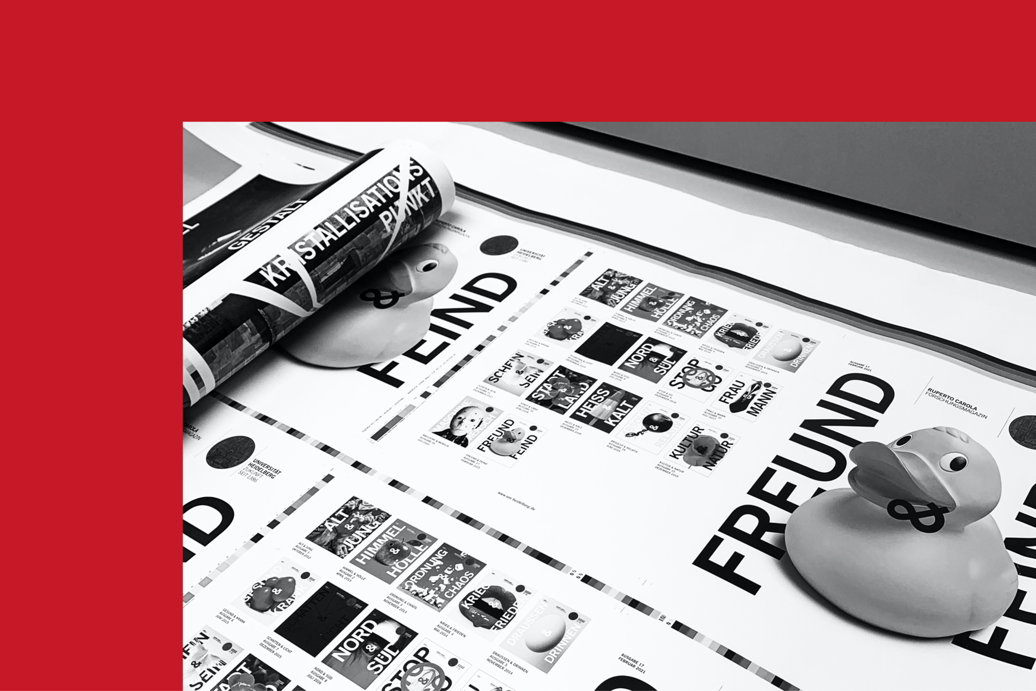
Opposites attract – and also draw readers. Heidelberg University took this idea to create the concept for their research magazine, »Ruperto Carola«: Every issue is dedicated to a pair of opposites (e.g. »War and Peace«, »Hot and Cold«, »Healthy and Sick«, »Culture and Nature«, »Absolute and Relative«), each of which is explored through articles from a variety of different research disciplines.
Academic feuilleton
The goal: To reach an audience beyond academia interested in the latest scientific findings while increasing awareness of how relevant, up-to-date and diverse this university of excellence (and Germany’s oldest university) truly is.
The right design
It was necessary to find the right design to provide an exclusive and highly aesthetic framework for this sophisticated content. We were responsible for the magazine design from the very first issue, and our approach obviously met both the publisher’s and audience’s expectations. The modern layout is streamlined and purposeful, free of academic mustiness. Bold headlines and the extensive use of white space allows the content to take centre stage. A great deal of research often goes into selecting the images, which are carefully aligned with each topic. This collaboration with photographers from around the world adds fascinating aesthetic and conceptual dimensions to each issue.

A popular figurehead
For the past 10 years, »Ruperto Carola« has done a truly excellent job. Every six months, the highly anticipated issue presents its bipolar topics in a well-founded, entertaining and easy to understand way that adequately reflects the respectable research work done at Heidelberg University.

Our many years of working with Heidelberg University continue. As a constant companion to the brand and designer of the magazine, we have a very close relationship with this institution.
What happened before
We worked for Ruprecht Karls University of Heidelberg for many years prior. Updating the university’s corporate design involved two major challenges: It was necessary to develop a system for the many different departments, institutes and other research facilities. At the same time, the logo was up for debate. We were able to convince everyone responsible to continue using the venerable university seal instead of drafting a new logo. We simplified it and adapted it for digital use. Today, it is still the symbol of a university that combines a historical awareness with a progressive passion for research.
Heidelberg University
Founded in 1386, it is the oldest in Germany and one of Europe’s leading research institutions. Successes in all funding rounds of the German competition for excellence and great international rankings underscore the institution’s leading role and outstanding reputation in the academic landscape. Heidelberg University defines itself as a research university with a strong international network and an emphasis on research-oriented instruction.
Meet the team
![Kms team silke streppelhoff 01 4 3]()
Silke Streppelhoff
Account Director
![Kms team angelo ressegatti 01 4 3]()
Angelo Ressegatti
Senior Designer