
HelloOpportunities
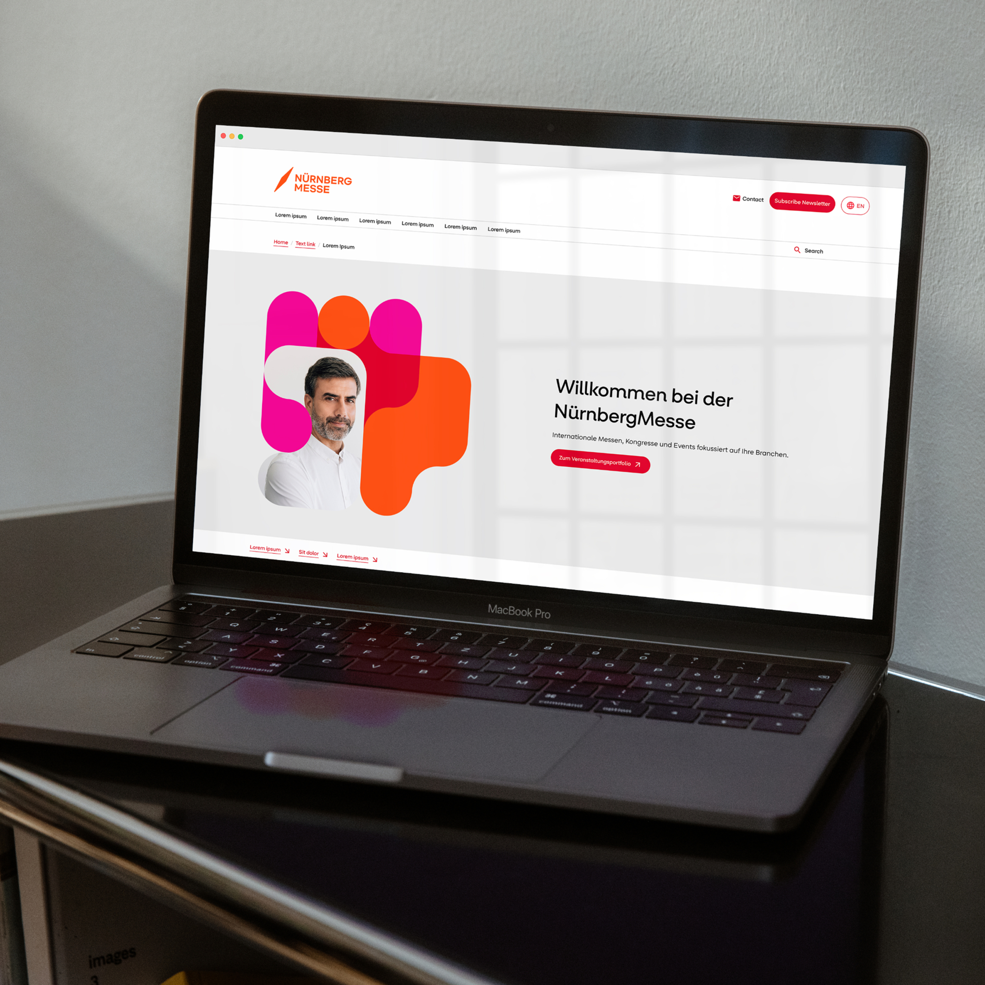
NürnbergMesse With a comprehensive rebranding, we strategically and visually repositioned NürnbergMesse. The aim was to better meet the demands of digital brand management and to strengthen the trade fair’s role as an international platform for connection, collaboration, and innovation. We designed the previous corporate design in 2014. Now, in close collaboration with the NürnbergMesse team, a new brand identity was created, anchored by the forward-looking brand idea »Hello Opportunities« as both a claim and the strategic core.
NürnbergMesse’s ambition — to be a meeting place for people and ideas where paths cross and new opportunities emerge — has been strategically and visually reinterpreted through the rebranding.
Energy of Connection –
Translated into Shapes and Colours
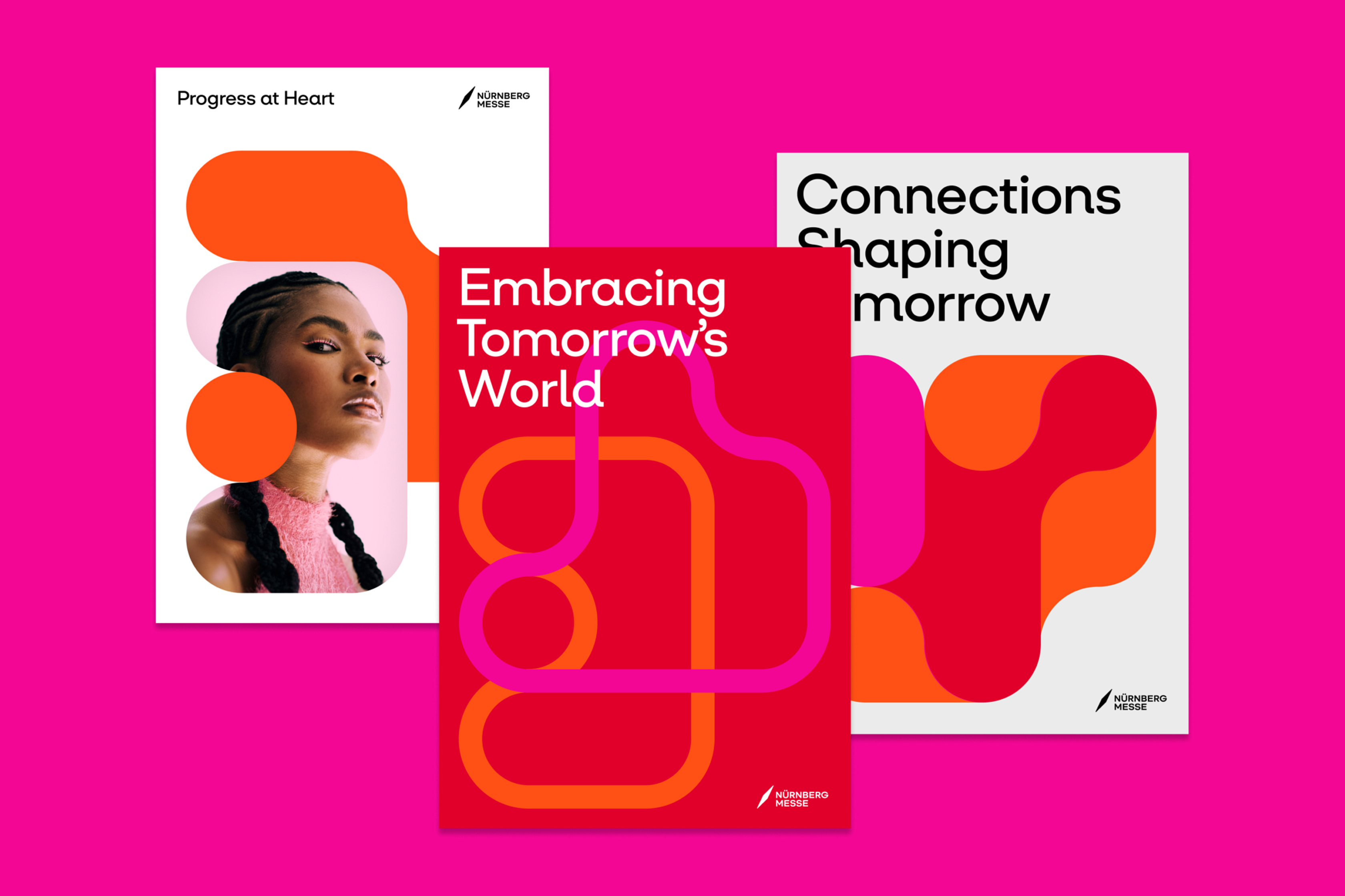
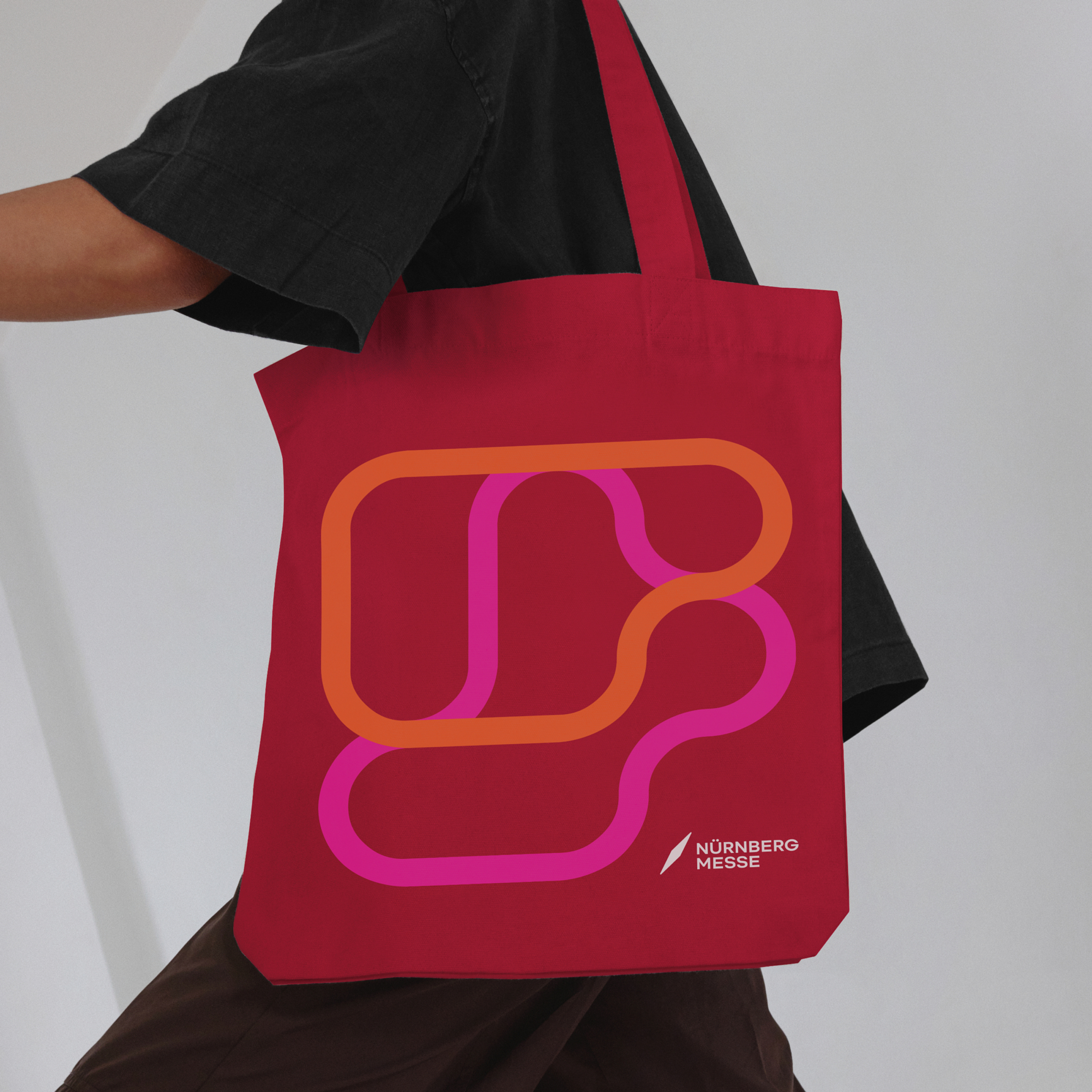
At the heart of the corporate design are the Connection Shapes. These can be created in endless variety and variation using a custom-developed Shape Generator, referencing the countless connections that take place both on the trade fair grounds and in digital spaces. Thanks to their generative nature, the shapes are produced brand-consistently and ready for production in their various forms and applications; they work equally well on large and small surfaces. They reflect the energy released when people, ideas, and companies come together. With the Shape Generator, NürnbergMesse is able to produce not only the shapes but also complete layouts quickly, efficiently, and entirely in-house for print, digital, motion, social media, and exhibition graphics.
The new, powerful colour palette combines tradition and modernity: We combine the familiar orange shade »Empowering Orange« with »Embracing Red« and »Inspirational Pink«. This ensures recognizability while at the same time highlighting the diversity of the trade fair through the expanded color spectrum. Together with shades of gray and blue, which are used as secondary and accent colors depending on the context, a 40-colour system has been created that works both digitally and analog, offering flexibility and international adaptability.
The Connection Shapes reference the countless connections that take place both on the trade fair grounds and in digital spaces.
Typographic Recognisability
Through Custom Details
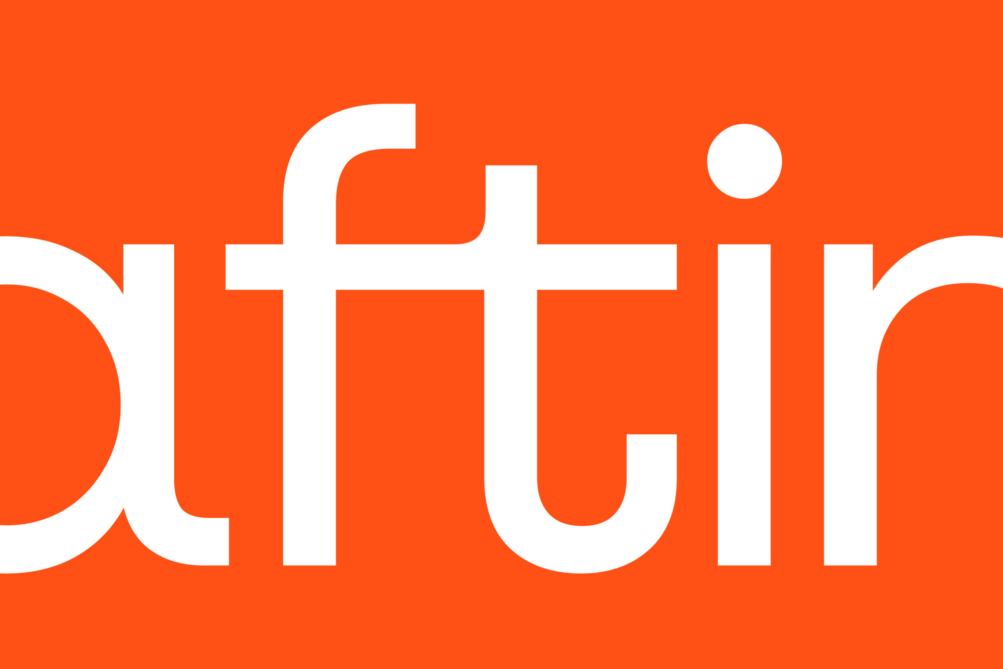
The new visual identity is complemented by a custom-developed variable font, directly derived from the graphic language and translating the routes of connection into the typography. Curved terminals and fluid transitions — such as between the letters f and t — make the typeface unique and strengthen the brand's recognizability.
Our design system also includes a revised logo, icons, and collage-style illustrations. It is accessible and developed according to WCAG/APCA standards — a crucial factor for international brand communication.
KMS TEAM has not only sharpened our self-image, but also translated it into a future-proof design that visually summarises our brand essence.
Connection as a Brand
With the rebranding, we created a future-proof, scalable, and digitally optimised brand identity together with NürnbergMesse. It works globally, significantly reduces internal production times, and positions the trade fair as an agile platform. The brand can now be experienced and felt in all its facets. »Hello Opportunities« becomes a promise to customers, partners, and exhibitors — both onsite and online— and underlines the power of connection, momentum, and inspiration.
NürnbergMesse Group
The NürnbergMesse Group is one of the 15 largest exhibition companies in the world. It employs around 1,200 people at 15 locations in Germany, Austria, Italy, Greece, Brazil, China, India, and the USA. Its portfolio of around 120 physical and digital events focuses on five key areas: Retail & Consumer Goods, Building & Construction, Process Technology, Electronics & Security, and Social & Public. These events safeguard over 12,000 jobs and generate billions in tax revenue and consumer spending each year – making NürnbergMesse a vital economic driver for the Nuremberg metropolitan region and across Germany.

