How to reinventthe bike
CANYON Long before the first iPhone changed the world, another visionary brought his idea to life: Cycling enthusiast Roman Arnold sold sports bikes using e-commerce – a truly revolutionary sales concept in 2002. The greatest challenge at the time proved to the customers, as they lacked confidence in online brands. The CANYON founder needed more than a strategic idea: He needed a dedicated partner to help him pave the way towards success.

Leading the race:
CANYON has been writing its impressive history of success since starting its collaboration with KMS TEAM. (CANYON brand sales in euros)
Our idea back in 2006 to position the CANYON brand in opposition to all conventions was absolutely correct. It’s still obvious today.
Pulling away from the competition
Simon Betsch, Managing Partner at KMS TEAM, was largely responsible for the CANYON strategy from the very beginning. He worked with the owner to lay the strategic framework for the non-conformist brand positioning: »In the early days, we discussed whether or not the brand should at least look like other brands due to the very unusual business model. But then we decided to take a completely proactive approach: CANYON should have a totally distinctive look and premium positioning to ensure that people see just how unique this brand really is.«


The ›Pure Cycling‹ promise is the main idea and the heart of the brand. It puts the ultimate cycling experience at the core of the entire brand world, providing a valuable point of reference for employees and customers alike.
The key to CANYON’s success: the brand’s driving force
It was easy to replace the originally improvised CANYON service centre and other areas with professional buildings. But the brand was far more concerned about what it needed to keep: namely the authentic passion of the CANYON team. We recognised this as the key to the brand’s success and cultivated it accordingly.
Efficient brand management from the outside in
A man of conviction who built the world’s lightest carbon bike out of pure love for the sport definitely has what it takes to become a global success – we were convinced of this from the very beginning. We also knew that the brand needed to be different in order to earn people’s trust. It needed to go against conventional trends and break with tradition. This required experience and leadership. Starting in 2005, we worked intensively on CANYON’s brand management – guiding the brand to the top of its sector over the next several years. At the same time, we helped CANYON build its own brand management team.


Riding into the wind
We explored every aspect of the company, carefully analysing its products and processes, customers, market competitors and culture – and became bike fans in the process. We still are today. CANYON’s identity as a high-end brand, the epitome of pure cycling passion, is as polarising as its logotype. Its design, product, communication – everything conveyed a completely new type of cycling. As such, the online purchase also became part of the distinctive brand experience.
Branding transforms businesses
Courage, quality, ambitious goals: Brands with this mindset benefit the most from working with us because we use branding in a strategic way – as an entrepreneurial tool that translates into valuable growth perspectives. Today, CANYON is a cult brand and an industry benchmark with a strong negotiating position in working with component manufacturers.
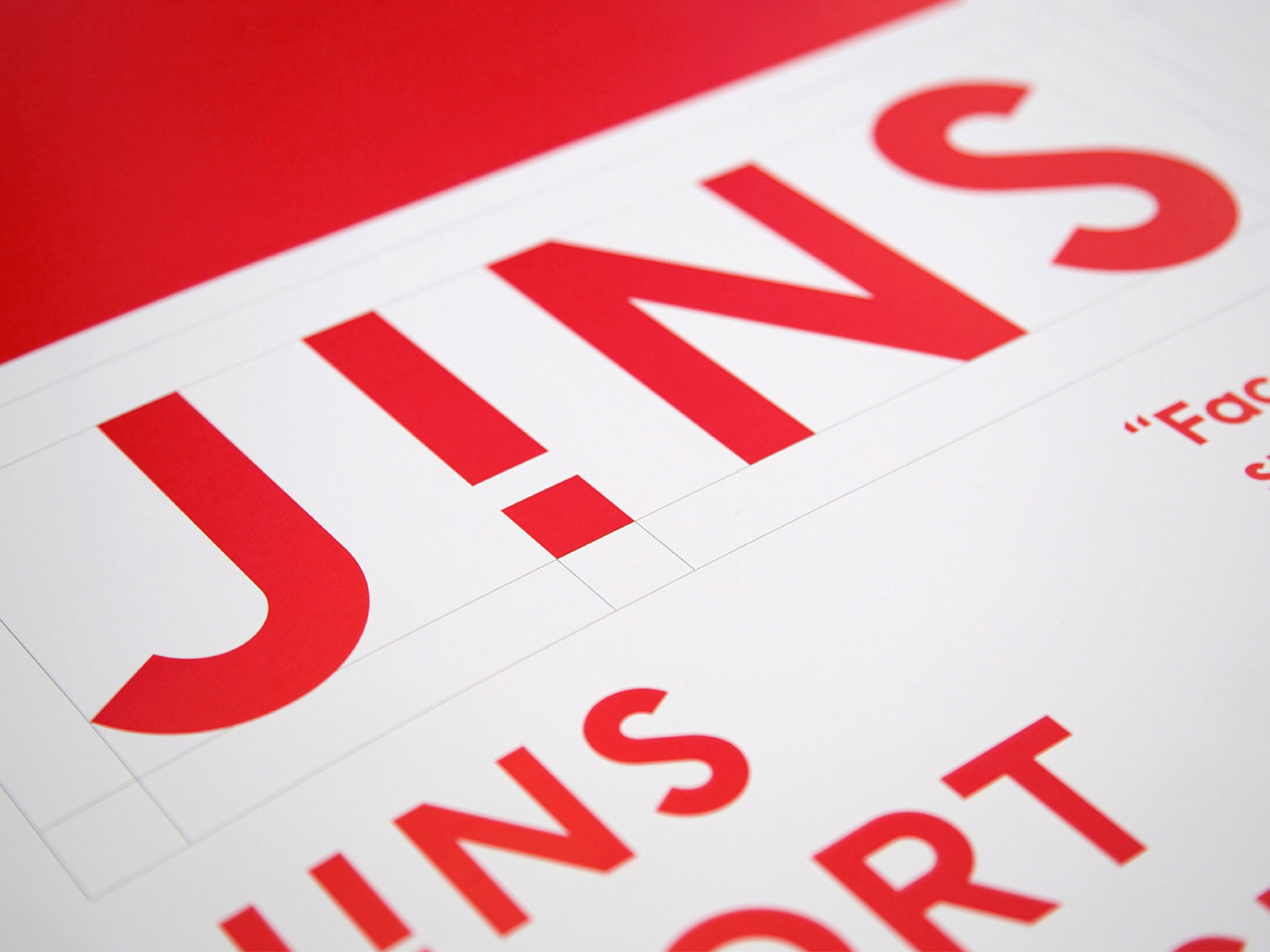
Design means being different
To reflect the company’s philosophy of always going in new directions, we decided to tip the type to the left – the opposite of the usual italic lettering. The result is a radical design that gives the entire industry a new way of seeing. The incline corresponds to the angle of the down tube on a bike frame.

Dynamic brands all did the same thing to show how »fast« they were: right-leaning italic letters. This is precisely why CANYON decided to go the opposite way.
Quote German Design Award judges’ panel:
»The logotype is what makes this outstanding visual identity truly phenomenal. The CANYON word mark is tilted an angle of around 20° to the left and severely cropped at the bottom. This creates a truly striking symbol with an incredible effect: If people once thought that right-leaning typefaces looked dynamic, they now notice that it looks even faster if the baseline of type extends ahead. We found this idea truly ingenious when applied to the bike frame: The angled supporting bar incorporates the logo, making it look like an even, horizontal texture that almost seems to hold back a bit. It’s also remarkable how consistently the visual identity is used across all of the company communication and architecture.« Judges’ panel explanation, German Design Award 2009
Writing brand history
In addition to the logotype, we also developed a clean, streamlined typeface for the brand: Canyon Text. We were inspired by the previous brand typeface, KnockOut, the Canyon logotype and typical road signage found in the sport of cycling – and used these references in the new typeface to further reinforce the brand identity. Canyon Text is used for web and print applications and is even featured on the products. The typeface family includes four typestyles.


A single physical and digital experience
It’s possible to have a great CANYON brand experience online – and in person as well. We developed the brand showroom in Koblenz 15 years ago, called CANYON Home. It brought the digital brand experience into the real world and has always been a must-see destination for fans of the brand. Today, it generates around 25% of CANYON’s sales in Germany alone.
CANYON
CANYON, the e-commerce pioneer in the sport bicycle market, has sold its proprietary premium racing bikes online since the mid-2000s. The company is also a material sponsor at high-profile sporting events like Giro d’Italia, Ironman and world cycling championships. The company has over 1,000 employees and generates annual sales of around 400 million euros – making it one of Europe’s most successful bicycle brands.
Meet the team
Lucie Groff
Account Director
Andreas Zeischegg
Design Director
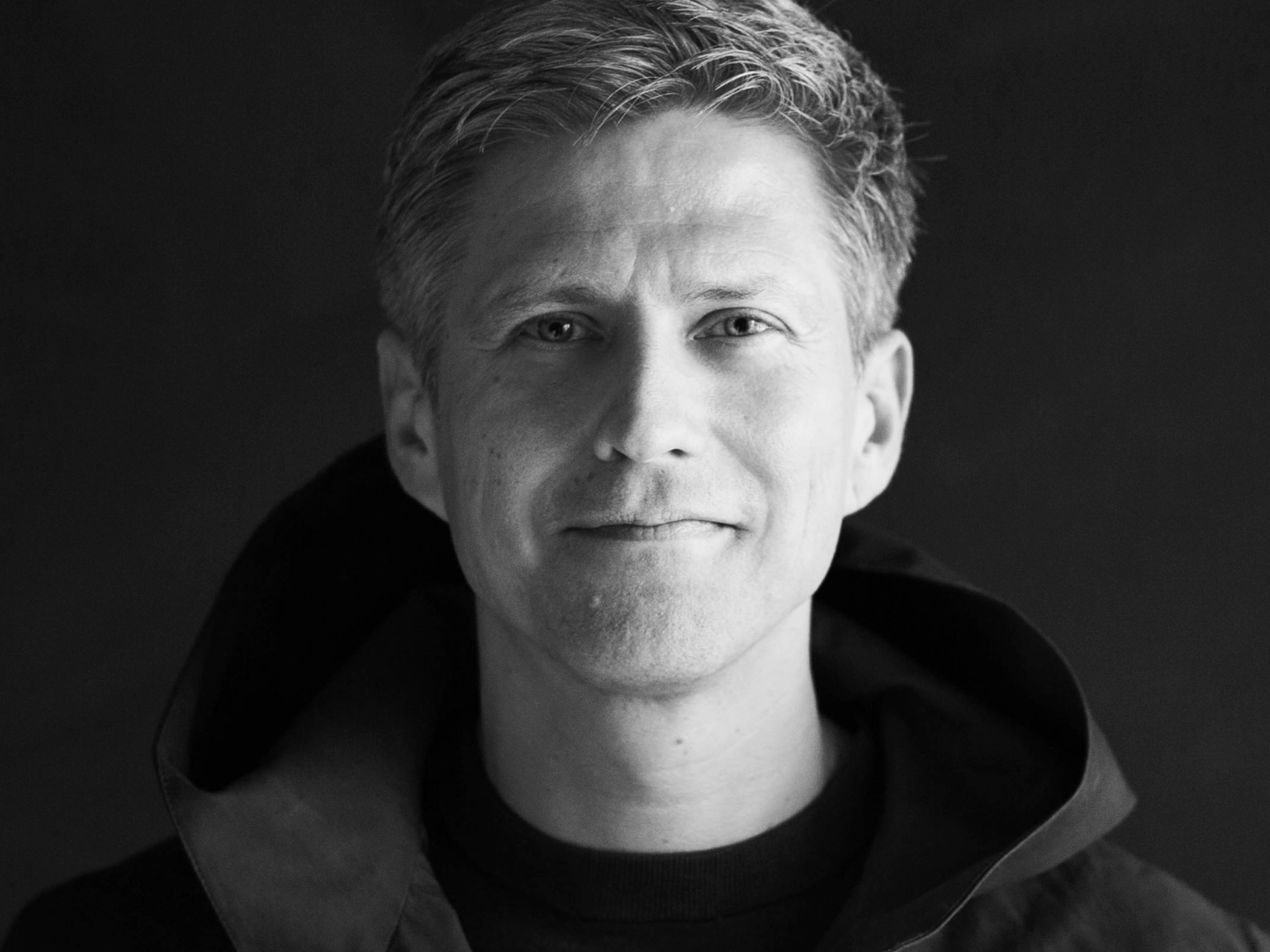
Simon Betsch
Managing Partner

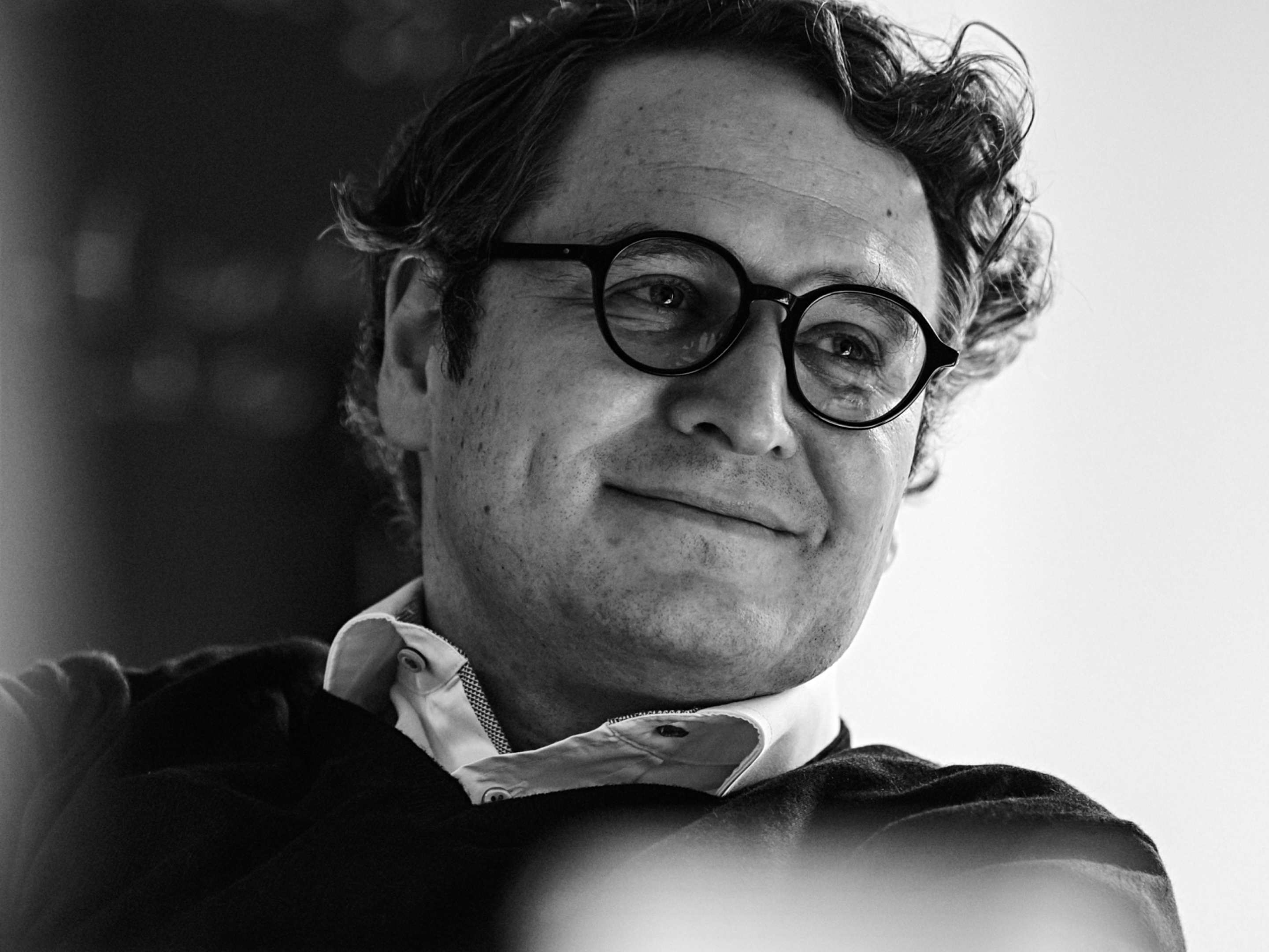
Patrick Märki
Managing Partner
Services and results
- Since 2006, we have provided CANYON with comprehensive support – from developing a disruptive corporate identity and corporate design to the unique brand experience.
- Corporate and brand communication, the corporate font and logo, as well as all international brand implementation efforts paved the way for CANYON’s ambitious expansion strategy.
- CANYON has grown its sales to around 400 million euros (2020) – an increase of 2.000%.
- Leading the ranking of Europe’s most popular bicycle brands (source: Bike Tour Magazine), CANYON sells sports bikes in over 100 countries today.
- Our strategic branding efforts, digital brand portal, corporate communication and specific brand experiences will help secure the premium position of this cult brand going forward, even in the digital age.