Don’t sweat,just swap!
ENYRING combines Yamaha Motor’s engineering expertise with an ambitious idea: sustainable electric mobility through a circular battery system. Companies / customers purchase an e-bike and use a flexible battery subscription, supported by a growing network of swap stations.
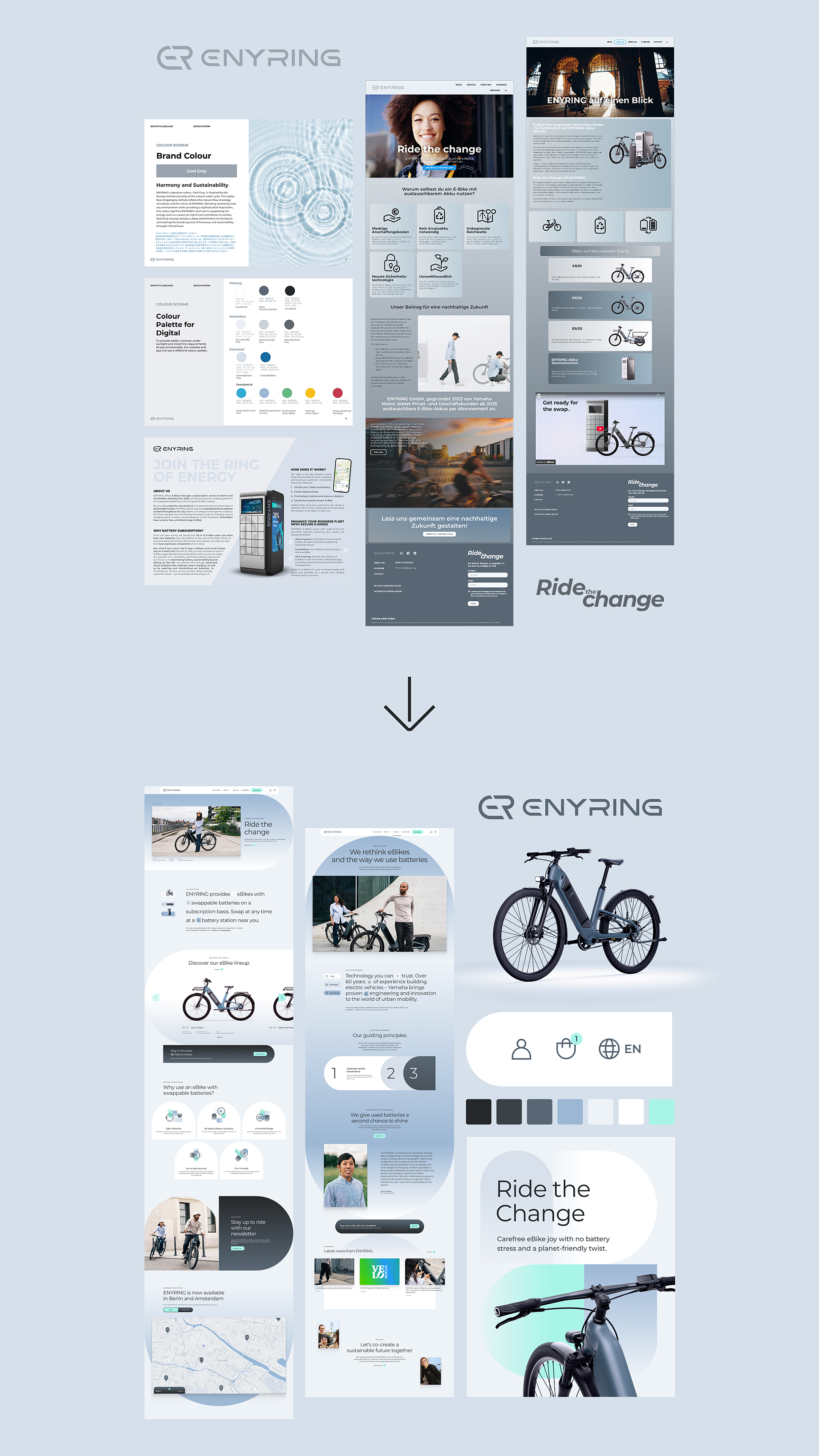
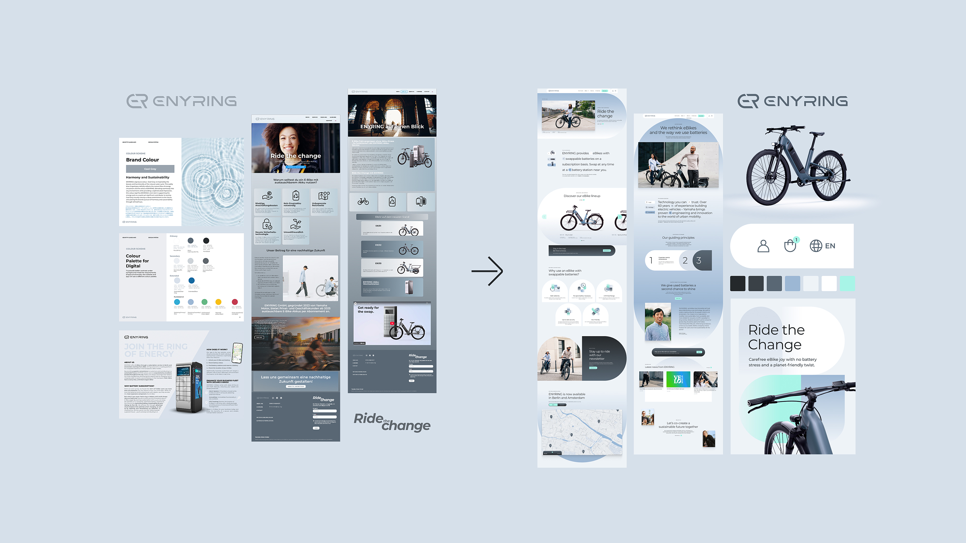
The starting point for evolving the corporate design and overall brand language was the newly conceived and designed corporate website and e-commerce platform. In this way, the digital core of the brand became the strategic foundation for shaping the entire brand experience.
A brand for a new mobility model
Building on Yamaha’s engineering expertise and technical DNA, the new brand identity translates the circular business model – combining e-bike purchase and battery subscription – into a clear, emotional and accessible brand experience for a new generation of urban, sustainable mobility.

Our mission is to make electric mobility more sustainable, more accessible, and more reliable for everyone.
Digital touchpoints at the core of the brand
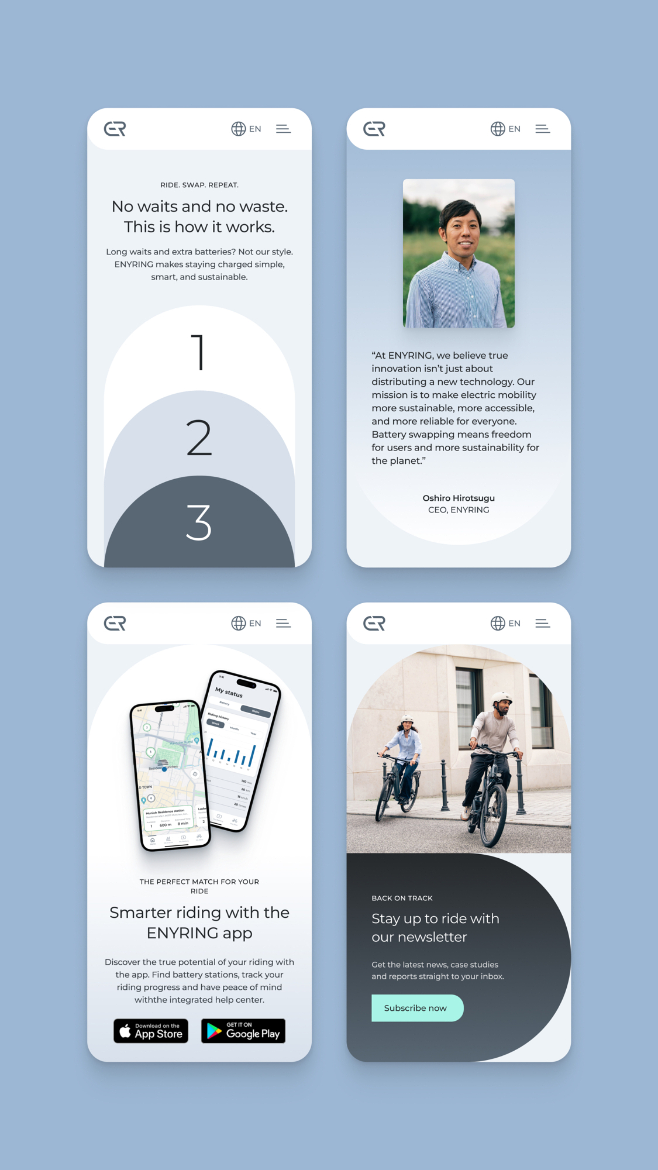
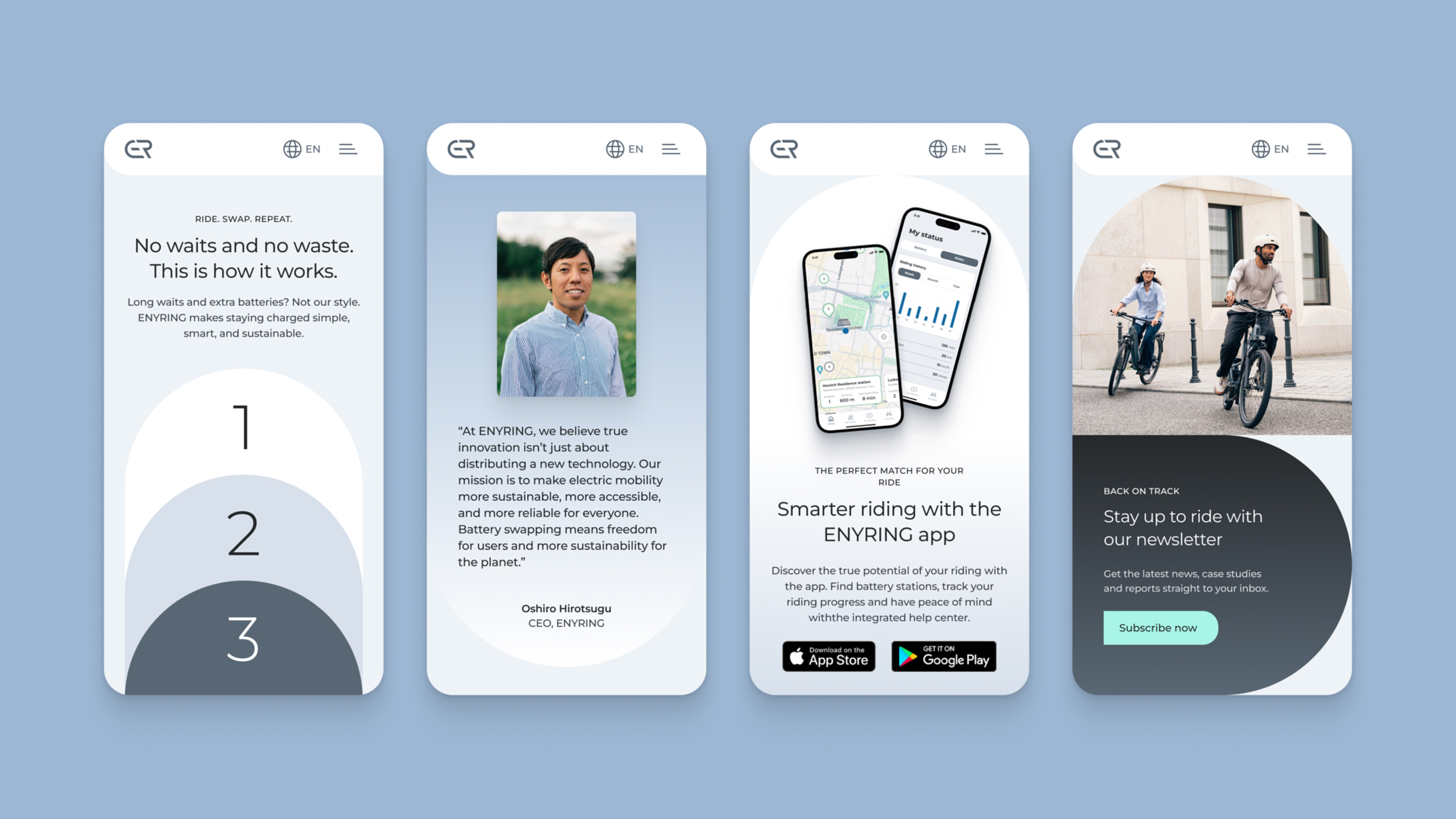
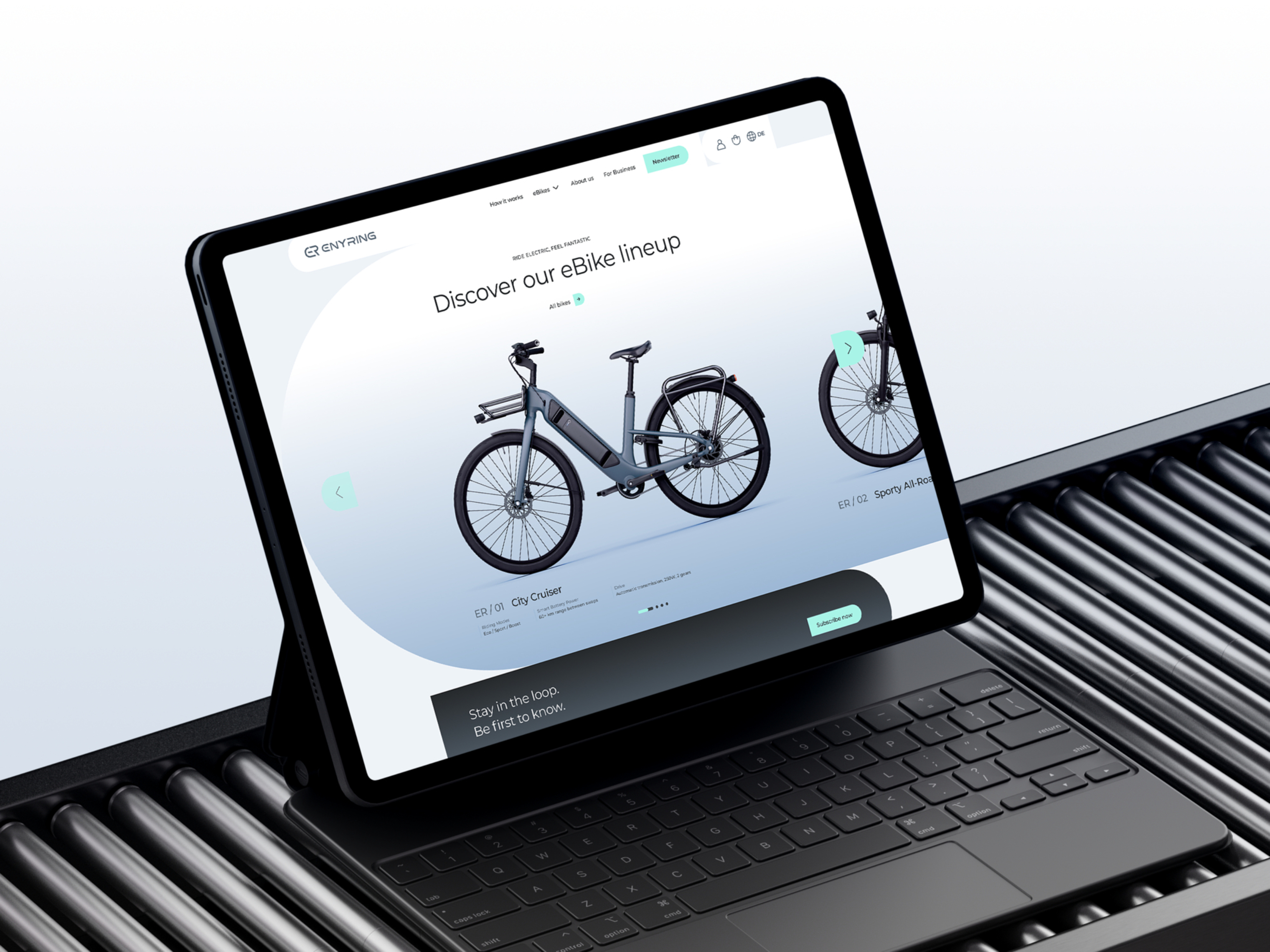
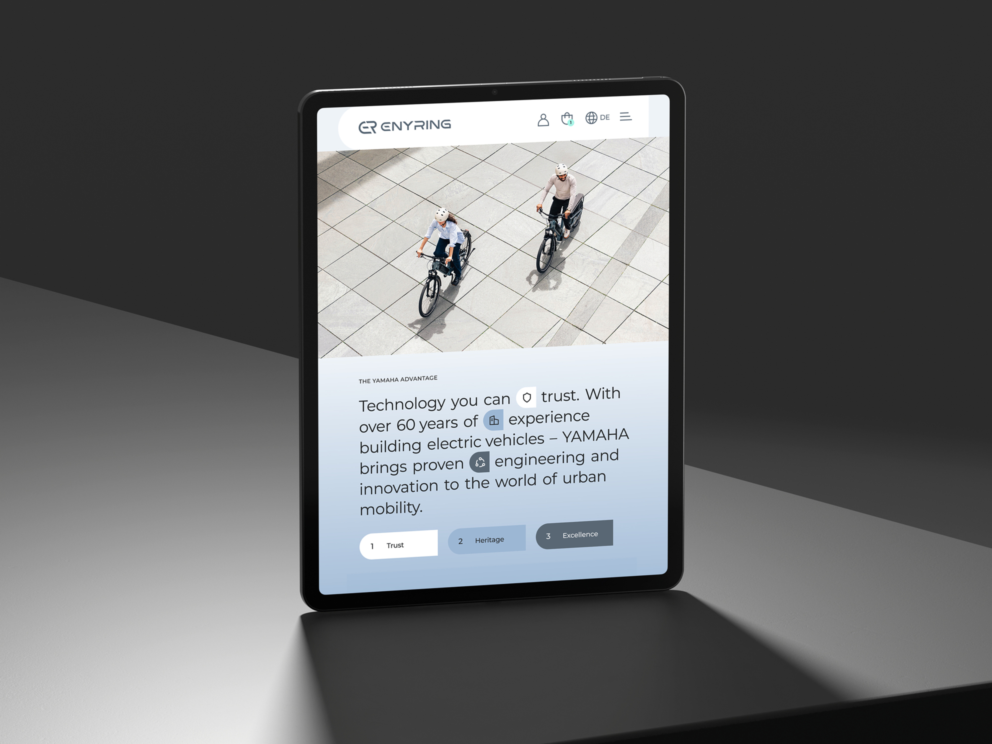
A key part of the project was the design of digital platforms as central touchpoints. We conceived and designed the new corporate website as the content and visual heart of the brand. It is complemented by the shop platform, which brings together products, the subscription model and battery swapping in an intuitive and easy-to-understand way. The overall experience translates the new design system into a clear user journey, making ENYRING’s innovative mobility offering immediately tangible.
Flexible principles instead of rigid rules
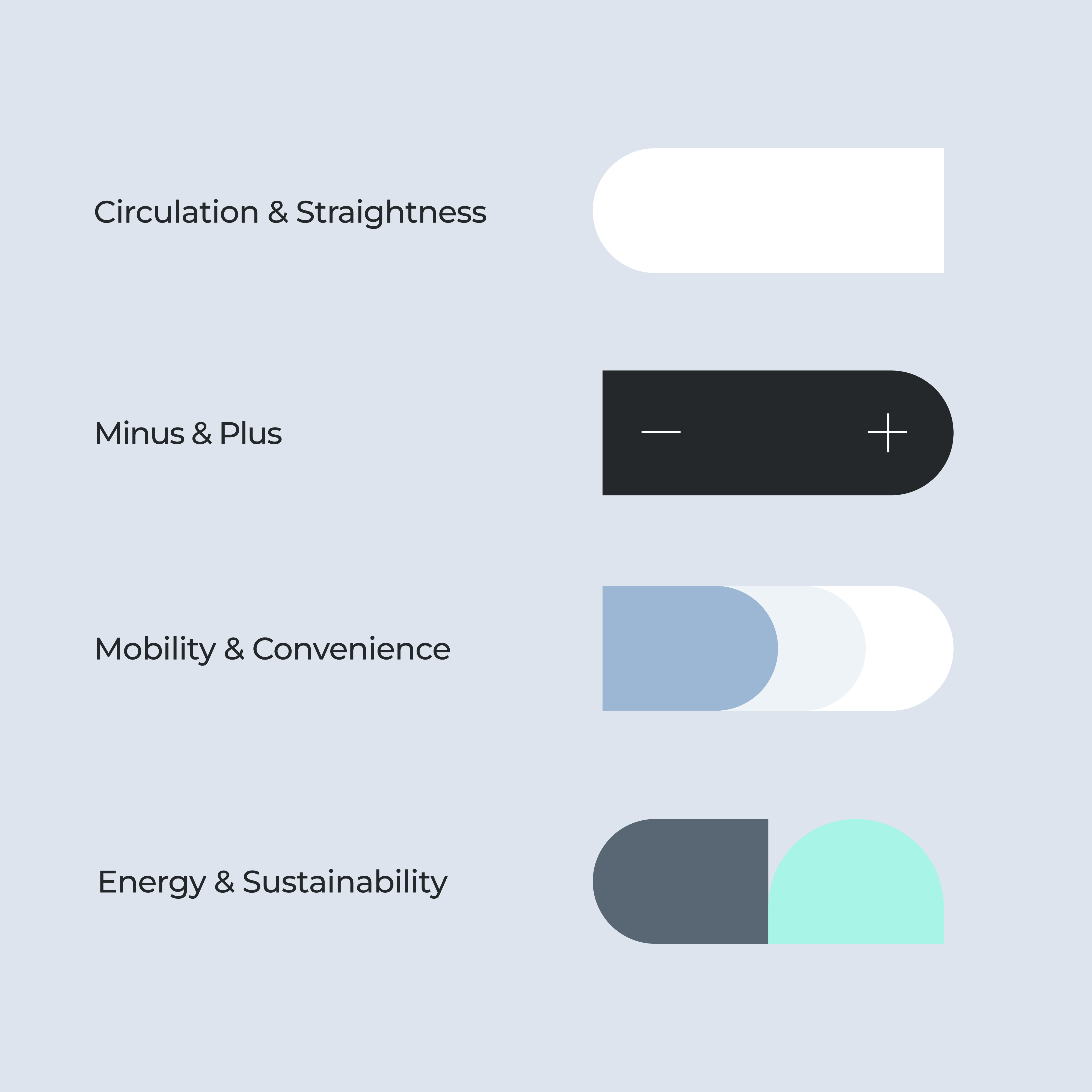
Instead of traditional brand values, we defined a set of design principles: circularity, movement, energy, accessibility, and technological clarity. On this basis, we carefully and purposefully refined the existing corporate design.
Within the project, we were responsible for:- the targeted adaptation of the existing colour system for both digital and physical applications
- the optimisation of typography for greater clarity and functionality
- the development of a contemporary graphic design that visualises circularity, dynamism and progress
- the expansion of this design language into a flexible, recognisable system that can be applied consistently across all touchpoints
A design system in motion
From these guiding ideas, a modular visual toolkit emerged: circular and linear elements in rhythmic compositions reflect the principle of the battery cycle and bring a sense of movement to the brand. A reduced, technical colour palette ensures clarity and credibility, while vibrant accents convey energy and momentum.
The system is designed to work consistently across product communication, digital applications and service stations in urban spaces – while remaining flexible enough to support future growth.
A distinctive visual language
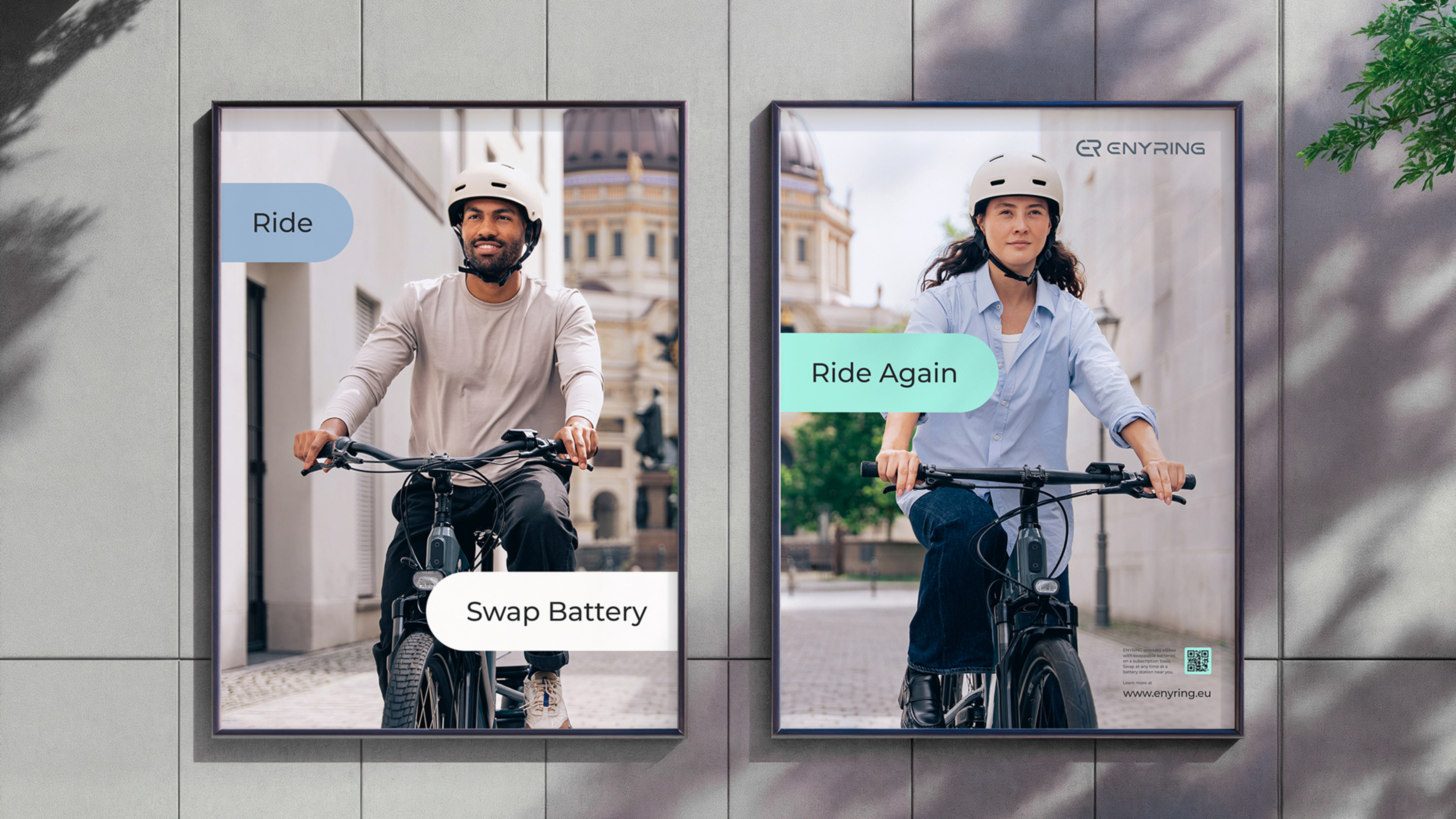
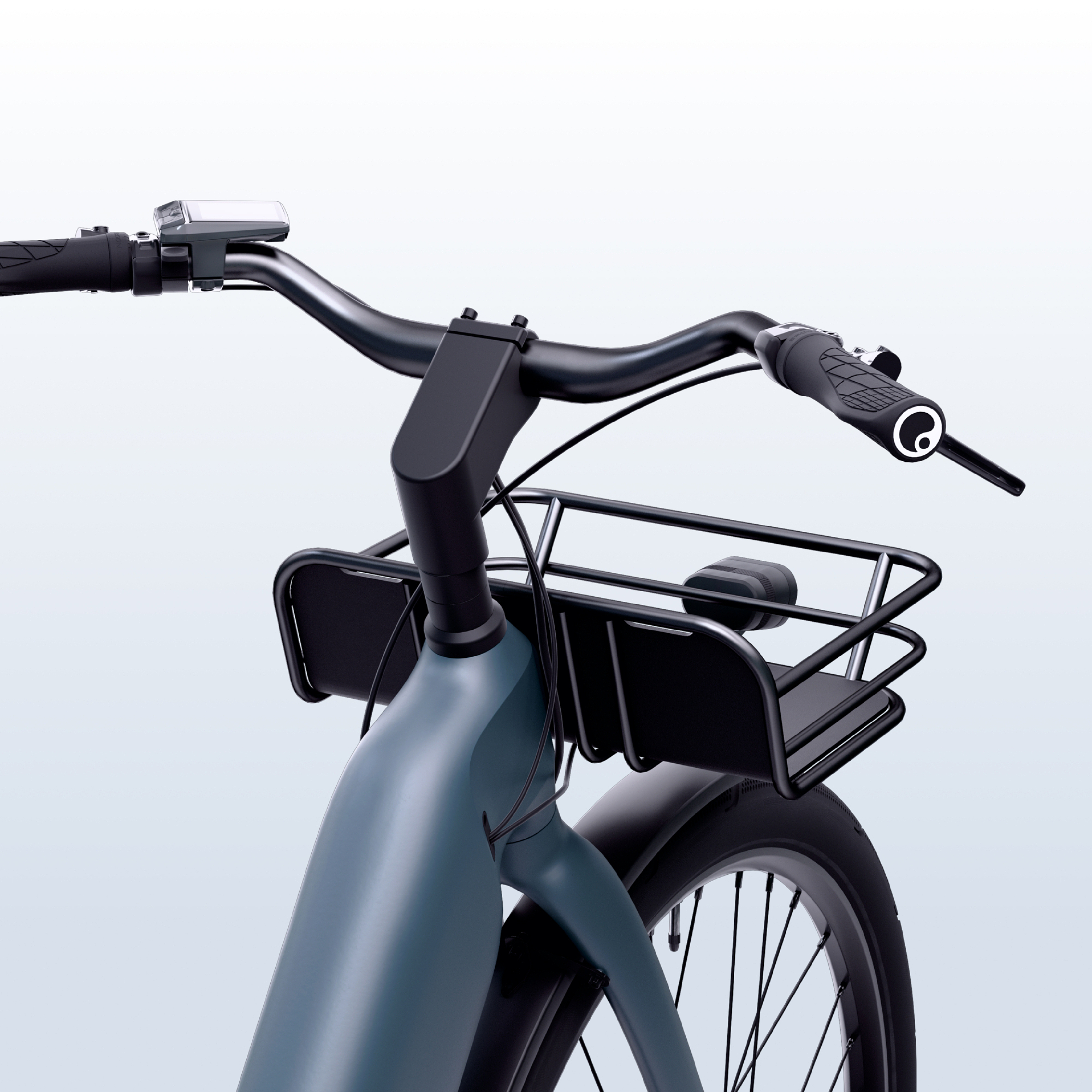
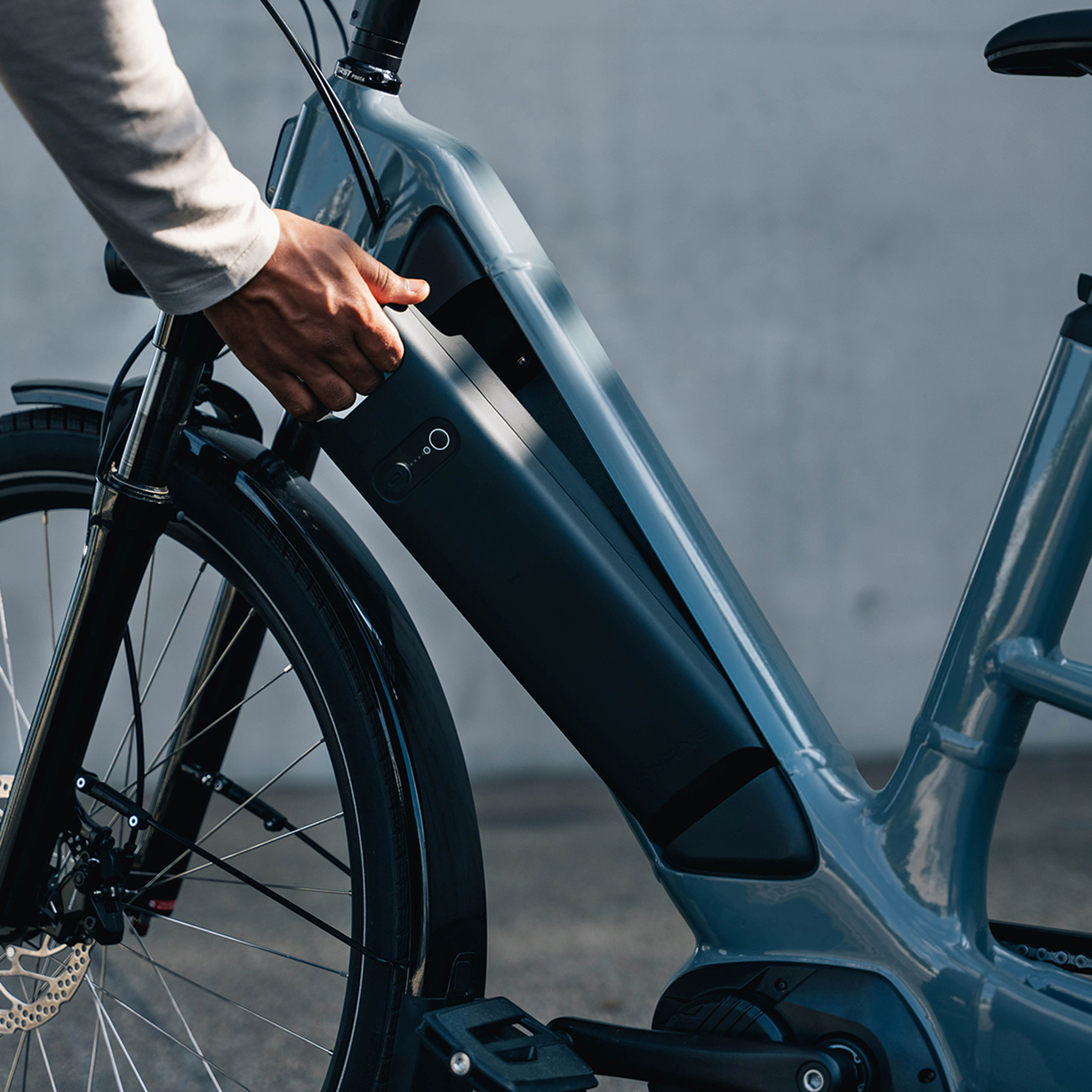
Alongside the graphic design, we led the art direction of the development of a distinctive visual language. The result is a combination of people and product photography where authenticity, urban lifestyle and technical precision come together. ENYRING is not presented as abstract technology, but as a natural and integrated part of everyday urban life.
ENYRING
ENYRING combines Yamaha Motor’s engineering excellence and expertise with a clear vision for the future of urban mobility. The young e-bike company brings together outstanding product quality, first-class service and a compelling customer experience, with a strong focus on sustainability, durability and innovation. As an independent brand within the Yamaha Motor Group, ENYRING stands for reliable, forward-looking mobility solutions.
With four e-bike models, an intelligent battery subscription and a growing network of battery swap stations, ENYRING is launching in Berlin and Amsterdam, setting a strong example for a new kind of urban mobility: more sustainable, accessible and reliable for everyone.
Credits
© Video and Photography: Marius Müller